Setup PICASO
In this tutorial you will learn:
What is a thermal emission spectrum
How various atmospheric factors (temperature, abundances, clouds) influence an emission spectrum
Given a spectrum, how do we analyze it’s components
What you should have already done:
Complete all Installation instructions
This involves downloading two files, one of which is large (6 Gig). So plan accordingly!
Questions? Submit an Issue to PICASO Github with any issues you are experiencing. Don’t be shy! Others are likely experiencing similar problems
[1]:
import warnings
warnings.filterwarnings('ignore')
import numpy as np
import pandas as pd
import os
import astropy.units as u
Here are the two main PICASO functions you will be exploring:
justdoit contains all the spectroscopic modeling functionality you will need in these exercises.
justplotit contains all the of the plotting functionality you will need in these exercises.
Tips if you are not familiar with Python or jupyter notebooks:
Run a cell by clicking shift-enter. You can always go back and edit cells. But, make sure to rerun them if you edit it. You can check the order in which you have run your cells by looking at the bracket numbers (e.g. [1]) next to each cell.
In any cell you can write
help(INSERT_FUNCTION)and it will give you documentation on the input/outputIf you type
jdi.followed by “tab” a box will pop up with all the available functions injdi. This applies to any python function (e.g.numpy,pandas)
[2]:
import picaso.justdoit as jdi
import picaso.justplotit as jpi
import picaso.opacity_factory as op
jpi.output_notebook() #will force all our plots to appear in the notebook
If you get an error regarding environment variables you can directly add them in the notebook. You just need to make sure you run this line of code BEFORE the import the ``picaso`` functions.
[3]:
#os.environ['picaso_refdata']='your_path'
Basic Inputs
Cross Section Connection
As you will continue seeing throughout the ERS training sessions, all rapid radiative transfer codes rely on a database of pre-computed cross sections. Cross sections are computed by using line lists in combination with critical molecular pressure broadening parameters. Both can either be derived from theoretical first principles (e.g. UCL ExoMol’s line lists), measured in a lab, and/or some combination thereof (e.g. HITRAN/HITEMP line lists).
When cross sections are initially computed, a resolution (\(\lambda/\Delta \lambda\)) is assumed. Cross sections are computed on a line-by-line nature and therefore usually computed for R~1e6. For JWST we are often interested in large bands (e.g. 1-14 \(\mu\)m). Therefore we need creative ways to speed up these runs. You will usually find one of two methods: correlated-k tables, and resampled cross sections. Garland et al. 2019 is a good resource on the differences between these two.
For this demonstration we will use the resampled cross section method. The major thing to note about using resampled cross sections is that you have to compute your model at ~100x higher resolution that your data. You will note that the opacity file you downloaded is resampled at R=10,000. Therefore you will note that in this tutorial we will always bin it down to R=100.
[4]:
opa = jdi.opannection(wave_range=[1,5])
Set Basic Planet and Stellar Inputs
Second step is to set basic planet parameters. To compute raw thermal flux, you only need gravity. However, if you want contrast units (relative flux of planet, to flux of star) you also need planet mass and radius, and stellar radius. Below, we specify the planet’s mass and radius.
[5]:
case1 = jdi.inputs()

#here we are going to have to specify gravity through R and M since we need it in the Flux calc
case1.gravity(mass=1, mass_unit=u.Unit('M_jup'), radius=1.2, radius_unit=u.Unit('R_jup'))

#here we are going to have to specify R as well
case1.star(opa, 4000,0.0122,4.437,radius=0.7, radius_unit = u.Unit('R_sun') )
Toy Models
How does climate structure influence resultant thermal flux?
Before we load in full atmospheric profiles. Let’s first gain intuition for how temperature-pressure profile influences your spectrum.
Building a toy model:
Select a pressure scale
More layers will increase the runtime of your code. The standard is ~50-90 levels.
It is critical that the range of pressure cover optically thick to optically thin regions. If you are concerned your range is too narrow, increase and test determine if it affects your spectrum. If it does, it is too narrow.
The standard is a pressure range is from 100 bar -1 microbar to be safe.
[6]:
nlevels = 50
pressure = np.logspace(-6,2,nlevels)
Specify vertical temperature profile that follows this scaling. We will try a few toy model examples:
isothermal
linearly increasing w/ pressure
linearly decreasing w/ pressure
[7]:
cases = ['iso','inc','dec']#will turn into the keys of our output
min_t = 500
max_t = 2000
t_iso = np.zeros(nlevels) + 1300 #temperature in kelvin (totally arbitrary!)
t_inc = np.linspace(min_t,max_t,nlevels)
t_dec = np.linspace(max_t,min_t,nlevels)
Specify your atmospheric abundance breakdown. We will try these toy models:
“well-mixed” : equal abundance at all pressure levels
For now, we will keep molecular abundances fixed, and vary the pressure-temperature profile. Let’s put these all together.
[8]:
atmo_iso = {
    'pressure':pressure,
    'temperature':t_iso,
    'H2': 0.80,
    'He': 0.19,
    'H2O':1e-3
}
atmo_inc = {
    'pressure':pressure,
    'temperature':t_inc,
    'H2': 0.80,
    'He': 0.19,
    'H2O':1e-3
}
atmo_dec = {
    'pressure':pressure,
    'temperature':t_dec,
    'H2': 0.80,
    'He': 0.19,
    'H2O':1e-3
}
We want to loop through these three different cases. So we need to repeat the steps above three times, while changing the atmospheric input each time.
[9]:
#let's store our three cases in toy_models
toy_models={}

#same as above but in a loop! three at once!
for case, atmo in zip(cases,[atmo_iso,atmo_inc,atmo_dec ]):
    toy_models[case] = jdi.inputs()
    toy_models[case].gravity(mass=1, mass_unit=u.Unit('M_jup'), radius=1.2, radius_unit=u.Unit('R_jup'))
    toy_models[case].star(opa, 4000,0.0122,4.437,radius=0.7, radius_unit = u.Unit('R_sun') )

    #NOW we vary this to run our three different toy models
    toy_models[case].atmosphere(df = pd.DataFrame(atmo))
And finally let’s create three different toy model spectra
[10]:
toy_out={}
for case in toy_models.keys():
    #picaso also has transmission, and reflected light options but let's specify
    #thermal for this tutorial
    toy_out[case] = toy_models[case].spectrum(opa, calculation='thermal',full_output=True)
Finally plot the sequence!
[11]:
wno,spec=[],[]
fig = jpi.figure(height=400,width=500, y_axis_type='log',
                 x_axis_label='Wavelength(um)',y_axis_label='Flux (erg/s/cm2/cm)')
#for reference, let's plot our three pt profiles next door
pt_fig = jpi.figure(height=400,width=300, y_axis_type='log',y_range=[1e2,1e-6],
                 x_axis_label='Temperature',y_axis_label='Pressure(bar)')
for i,case in enumerate(toy_out.keys()):
    x,y = jdi.mean_regrid(toy_out[case]['wavenumber'],
                          toy_out[case]['thermal'], R=150)

    fig.line(1e4/x,y,color=jpi.Colorblind8[i],line_width=3,
               legend_label=case)

    pt_fig.line(toy_out[case]['full_output']['level']['temperature'],
             pressure,color=jpi.Colorblind8[i],line_width=3)
fig.legend.location='bottom_right'

jpi.show(jpi.row([fig,pt_fig]))
What are the characteristic features of each spectrum?
The first obvious feature is that our isothermal case follows a perfect blackbody. The second two might not be immediately noticeable if you are not familiar with the absorption cross section of H2O. Let’s take a look.
How does absorption influence resultant thermal flux?
Molecular Absorption
Our toy model included water absorption, along with H2/He. In order to see the cross section of H2O we can use PICASO’s opacity factory. This will show you the specific absorptive power of H2O at a specific pressure and temperature. Let’s pick a single P and T that is representative of our toy models in order to gain an intuition for where water is absorbing
[12]:
#database should be the same for everyone
db_filename = opa.db_filename
species_to_get = ['H2O']
t_to_get = [1500]#kelvin
p_to_get = [1] #in bars
data  = op.get_molecular(db_filename, species_to_get, t_to_get,p_to_get)
[13]:
x,y = jdi.mean_regrid(data['wavenumber'],data['H2O'][1500][1.0], R=150)
#plot data
h2o_fig = jpi.figure(height=300,y_axis_type='log',x_range=[1,5],y_range=[1e-24,5e-20]
                    , x_axis_label='Micron',y_axis_label='Cross Section (cm2/species)')
h2o_fig.line(1e4/x, y,line_width=4)
jpi.show(h2o_fig)
Exercise: This plot shows where the absorptive strength of water peaks. Find the peaks of water in the cross section plot and correlate them with the peaks and troughs of your toy model.
In the case where temperature is increasing with increasing pressure, does the flux or your spectrum increase toward the peak of an absorption feature? And vice versa? What does this tell you about where the flux is emanating from at band center, band trough?
Continuum Absorption
A second, more subtle contributor to the spectrum is the continuum absorption from H2, He, which we included. At first glance it might look like H2O contribution is the only contributor to our toy models. Let’s take a closer look at one case by using the get_contribution function.
Get contribution function
This output consists of three important items:
taus_per_layer
Each dictionary entry is a nlayer x nwave that represents the per layer optical depth for that molecule.
cumsum_taus
Each dictionary entry is a nlevel x nwave that represents the cumulative summed opacity for that molecule.
tau_p_surface
Each dictionary entry is a nwave array that represents the pressure level where the cumulative opacity reaches the value specified by the user through
at_tau.
[14]:
contribution = jdi.get_contribution(toy_models['inc'], opa, at_tau=1)
[15]:
#explore the output
contribution['tau_p_surface'].keys()
[15]:
dict_keys(['H2H2', 'H2He', np.str_('H2O'), 'rayleigh', 'cloud'])
[16]:
wno=[]
spec=[]
labels=[]
for j in contribution['tau_p_surface'].keys():
    x,y = jdi.mean_regrid(opa.wno, contribution['tau_p_surface'][j],R=100)
    if np.min(y)<5: # Bars
        wno+=[x]
        spec+=[y]
        labels +=[j]
fig = jpi.spectrum(wno,spec,plot_width=600,plot_height=350,
                   y_axis_label='Tau~1 Pressure (bars)',
                   y_axis_type='log',x_range=[1,5],
                     y_range=[1e2,1e-4],legend=labels)
jpi.show(fig)
[17]:
#this plot does the same thing and we will use it from now on
jpi.show(jpi.molecule_contribution(contribution, opa,
                                   min_pressure=4.5,
                                  R=100))
This plot shows where the optical depth=1 (i.e. tau=1) surface is for the different absorbing components of your model. In this case, the tau=1 surface of H2O is far above that of the continuum. Therefore, for the toy model we have specified, the continuum is not contributing to the overall spectrum.
Exercise: In this toy model example, at what abundance of H2O does the continuum become important? In those cases, what is the result on the final spectrum? Run the abundance cases below to find out.
[18]:
#let's store our three cases in toy_models
vary_h2o_out={}

#same as above but in a loop over a h2o abundance multilier
h2o_factors = [100, 10, 1, 1e-1, 1e-2]
for ifact in h2o_factors:
    pln = jdi.inputs()
    pln.gravity(mass=1, mass_unit=u.Unit('M_jup'), radius=1.2, radius_unit=u.Unit('R_jup'))
    pln.star(opa, 4000,0.0122,4.437,radius=0.7, radius_unit = u.Unit('R_sun') )

    #NOW we vary this to run our three different toy models
    pln.atmosphere(df = pd.DataFrame(atmo_inc))

    #to figure out the problem above, we can artificially decrease/increase H2O
    pln.inputs['atmosphere']['profile']['H2O'] = (ifact *
                                                  pln.inputs['atmosphere']['profile']['H2O'])
    #and rerun the spectrum with those different abundances
    vary_h2o_out[ifact] = pln.spectrum(opa, calculation='thermal', full_output=True)
Finally plot!
[19]:
wno,spec=[],[]
fig = jpi.figure(height=400,width=500, y_axis_type='log',
                 x_axis_label='Wavelength(um)',y_axis_label='Flux (erg/s/cm2/cm)',
                title='Toy model with varied H2O abundance')

#can create a little color scale for each of our spectra
colors = jpi.pals.viridis(len(h2o_factors))
for i,case in enumerate(vary_h2o_out.keys()):
    x,y = jdi.mean_regrid(vary_h2o_out[case]['wavenumber'],
                          vary_h2o_out[case]['thermal'], R=150)

    fig.line(1e4/x,y,color=colors[i],line_width=3,
               legend_label=f'{case}xH2O')

fig.legend.location='bottom_right'

jpi.show(fig)
There are two factors influencing the spectrum. The first is the increased opacity of the water itself. Why does flux increase with decreasing water abundance?
The second, less noticeable is the new contribution from the continuum opacity. Can you eyeball where the continuum kicks in? One trick is to normalize each spectrum by its mean value to compare the relative size of the absorption features. This isolates the size of the absorption features while removing the increased flux from decreased water abundance.
[20]:
wno,spec=[],[]
fig = jpi.figure(height=400,width=500, #y_axis_type='log',
                 x_axis_label='Wavelength(um)',y_axis_label='Flux (erg/s/cm2/cm)',
                title='Normalized toy model with varied H2O abundance')

#can create a little color scale for each of our spectra
colors = jpi.pals.viridis(len(h2o_factors))
for i,case in enumerate(vary_h2o_out.keys()):
    x,y = jdi.mean_regrid(vary_h2o_out[case]['wavenumber'],
                          vary_h2o_out[case]['thermal'], R=150)
    spec += [y]
    fig.line(1e4/x,y/np.mean(y),color=colors[i],line_width=3,
               legend_label=str(case))

fig.legend.location='bottom_right'

jpi.show(fig)
Now can you tell? When water is fully dominant (dark purple) the delta peak-trough flux is the highest. When the continuum is added, the H2H2/H2He opacity interferes with the H2O absorption. The window regions, which would otherwise be optically thin and sensitive to the highest pressures, are now blocked by the continuum opacity. This is an important effect as it will come back to haunt us in the cloud exercises. Let’s take a look at the contribution plot for our 0.01xH2O case, to see how H2H2 and H2He now play a role.
[21]:
#PLN is from the last run in the cell above
contribution = jdi.get_contribution(pln, opa, at_tau=1)

jpi.show(jpi.molecule_contribution(contribution, opa,
                                   min_pressure=4.5,
                                  R=100))
Ah ha! We see in this case the continuum and the molecular absorption from H2H2 and H2He now compete across wavelength space.
Confirm understanding: Does this make sense with what you noted from the raw and normalized spectra? What is happening to the raw spectra in the regions most dominated by continuum opacity?
How to determine what pressures you are sensitive to?
One major aspect of understanding thermal emission is understanding where (in pressure) your flux is emanating from. The tau=1 surface plots should give you a rough idea of this. You can see that in our 0.01xH2O case above, the flux is coming from roughly 1 bars.
Another way to visualize this, and relate it back to your spectrum is by comparing your raw spectra against blackbody curves. What is most helpful is to pick temperatures at known pressures along your climate profile.
Exercise: Revisit the Pressure-temperature profile for the inc case. Even though we are increasing water abundance, all those cases still are computed from the same pressure-temperature profile. Pick three pressures along this curve. Determine what the temperature is at those pressures. Use the blackbody function to compute three blackbodies and compare against your thermal flux spectra.
[22]:
wno,spec=[],[]
fig = jpi.figure(height=400,width=500, y_axis_type='log',
                 x_axis_label='Wavelength(um)',y_axis_label='Flux (erg/s/cm2/cm)',
                title='Toy model with varied H2O abundance')

#for reference, let's plot our pt profile next door
pt_fig = jpi.figure(height=400,width=300, y_axis_type='log',y_range=[1e2,1e-6],
                 x_axis_label='Temperature',y_axis_label='Pressure(bar)')
pt_fig.line(toy_out['inc']['full_output']['level']['temperature'],
             pressure,color='black',line_width=3)

#same exact code as before
colors = jpi.pals.viridis(len(h2o_factors))
for i,case in enumerate(vary_h2o_out.keys()):
    x,y = jdi.mean_regrid(vary_h2o_out[case]['wavenumber'],
                          vary_h2o_out[case]['thermal'], R=150)

    fig.line(1e4/x,y,color=colors[i],line_width=3,
               legend_label=f'{case}xH2O')
#show for reference first
jpi.show(jpi.row([fig, pt_fig]))
[23]:
#STEPS FOR EXERCISE
#Step 1: pick a pressure
at_pressure=1#bar
#Step 2: what is the temperature of your planet at that pressure
corresponding_t = 1630 #Kelvin, I have just eyeballed this from the plot
#Step 3: use the plack function to compute the blackbody flux
corr_intensity = jpi.blackbody(corresponding_t, 1/opa.wno)[0]
corr_flux = np.pi * corr_intensity
#Step4: add to your plots
pt_fig.scatter(corresponding_t, at_pressure, size=10, color='black')
fig.line(1e4/opa.wno, corr_flux, color='black',line_width=4)
jpi.show(jpi.row([fig, pt_fig]))
Does this checkout out with your tau=1 pressure curves for the 0.01xH2O case you made above? What about the increased water abundance plots?
Exercise: Using this methodology, for each of these 1-5 micron spectra, determine the range of pressures your spectrum is sensitive to?
Now that you have gone through the exercise, you can use the prebuilt PICASO function.
[24]:
f=jpi.flux_at_top(vary_h2o_out[1], pressures=[1,0.1,0.01],R=150)
f.legend.location='bottom_right'
jpi.show(f)
Parameterized Pressure-Temperature Profiles
In lecture you learned about the double gray model, which is an exoplanet-relevant analytic solution of the two-stream equation Guillot et al. 2010. You also encountered this in last week’s transmission tutorial. The basic equation is:
Where the limits are:
\(\gamma>>1\) : “greenhouse” limit with a hot deep atmosphere
\(\gamma=1\) : isothermal atmosphere with T \(= \frac{F_\odot}{\sigma}^{1/4}\)
\(\gamma<<1\) : “anti-greenhouse” limit, thermal inversion
[25]:
pt_fig = jpi.figure(height=400,width=300, y_axis_type='log',y_range=[1e2,1e-6],
                 x_axis_label='Temperature',y_axis_label='Pressure(bar)')
#first, tau
#let's assume the optical depth logarithmically increases from 1e-5-1000
tau =np.logspace(-5,3,50)
#this will roughly follow our pressure scale
pressure = np.logspace(-6,2,50)

F_sig = 1500**4 #we can play around with this insolation scaling

#gamma
gamma_gt_1 = 10
gamma_lt_1 = 0.1
gamma_1 = 1
for i,ig in enumerate(zip([gamma_1,gamma_lt_1, gamma_gt_1],['g=1','g<1','g>1'])):
    g = ig[0]
    legend=ig[1]

    temperature = (F_sig * ((1/g -g)*np.exp(-tau/g) +1 + g)) **(0.25)
    pt_fig.line(temperature,
             pressure,color=jpi.Colorblind8[i],line_width=3,legend_label=legend)

jpi.show(pt_fig)
Exercise: Make sure you have an intuition for how the parameters gamma, tau, and Fsig affect the resulting PT profile.
We’ve already learned that the isothermal profile will return back the blackbody. Let’s use one of the “greenhouse” limit pressure-temperature profiles to proceed with creating a full thermal emission spectrum.
Combing parameterized climate with chemistry
[26]:
case1 = jdi.inputs()
case1.gravity(mass=1, mass_unit=u.Unit('M_jup'), radius=1.2, radius_unit=u.Unit('R_jup'))
case1.star(opa, 4000,0.0122,4.437,radius=0.7, radius_unit = u.Unit('R_sun') )

#NOW let's add our parameterized profile
case1.atmosphere(df = pd.DataFrame({
                'pressure':pressure,
                'temperature':temperature}),verbose=False)
Now we need to add the chemistry! PICASO has a prebuilt chemistry table that was computed by Channon Visscher. You can use it by adding it to your case1. Two more chemistry parameters are now going to be introduced:
C/O ratio: Elemental carbon to oxygen ratio
M/H: Atmospheric metallicity
Let’s choose Solar values. Feel free to explore the effect of this after the first completed spectrum.
[27]:
log_mh = 0 #log relative to solar
c_o = 0.55 #solar value
case1.chemeq_visscher_2121( c_o, log_mh)
Now you can check out what has been added to your case1 bundle
[28]:
case1.inputs['atmosphere']['profile'].head()
[28]:
| pressure | temperature | e- | H2 | H | H+ | H- | H2- | H2+ | H3+ | ... | LiF | C | O | Mg | Mg+ | Si | Fe+ | Ti | Ti+ | C+ | |
|---|---|---|---|---|---|---|---|---|---|---|---|---|---|---|---|---|---|---|---|---|---|
| 0 | 0.000001 | 1536.173990 | 1.383018e-07 | 0.806785 | 0.024211 | 1.317658e-32 | 8.088827e-15 | 7.054388e-23 | 4.166178e-36 | 1.444987e-29 | ... | 5.660751e-14 | 1.014047e-19 | 1.037010e-08 | 0.000067 | 4.928287e-15 | 1.677986e-11 | 4.098758e-16 | 1.916844e-10 | 6.922073e-18 | 3.410395e-42 |
| 1 | 0.000001 | 1536.175567 | 1.210079e-07 | 0.810482 | 0.020107 | 8.588282e-33 | 8.561003e-15 | 9.031204e-23 | 3.284604e-36 | 1.377971e-29 | ... | 6.842272e-14 | 1.018179e-19 | 7.106197e-09 | 0.000067 | 3.875419e-15 | 1.681433e-11 | 3.223117e-16 | 1.925179e-10 | 5.455721e-18 | 2.687309e-42 |
| 2 | 0.000002 | 1536.177864 | 1.058774e-07 | 0.814197 | 0.016700 | 5.597986e-33 | 9.060848e-15 | 1.156215e-22 | 2.589698e-36 | 1.314107e-29 | ... | 8.270332e-14 | 1.022349e-19 | 4.869672e-09 | 0.000067 | 3.047546e-15 | 1.684905e-11 | 2.534600e-16 | 1.933564e-10 | 4.300105e-18 | 2.117652e-42 |
| 3 | 0.000003 | 1536.181210 | 9.250124e-08 | 0.817801 | 0.013869 | 3.654382e-33 | 9.574887e-15 | 1.477805e-22 | 2.044722e-36 | 1.254857e-29 | ... | 9.995352e-14 | 1.026397e-19 | 3.337509e-09 | 0.000068 | 2.400054e-15 | 1.687922e-11 | 1.996100e-16 | 1.941648e-10 | 3.393892e-18 | 1.671127e-42 |
| 4 | 0.000004 | 1536.186082 | 7.940680e-08 | 0.819912 | 0.011508 | 2.426562e-33 | 9.931843e-15 | 1.852225e-22 | 1.640521e-36 | 1.216391e-29 | ... | 1.206616e-13 | 1.028486e-19 | 2.290511e-09 | 0.000068 | 1.922520e-15 | 1.685212e-11 | 1.598943e-16 | 1.945583e-10 | 2.720926e-18 | 1.339907e-42 |
5 rows × 52 columns
Now we are ready to compute the spectrum
[29]:
out_solar = case1.spectrum(opa, calculation='thermal',full_output=True)
#get the contribution as well now that we have all the chemistry!
contribution = jdi.get_contribution(case1, opa, at_tau=1)
#regrid
wno, fp = jdi.mean_regrid(out_solar['wavenumber'], out_solar['thermal'], R=150)
[30]:
jpi.show(jpi.spectrum(wno, fp, y_axis_type='log',
                      y_axis_label='Flux (erg/cm2/s/cm)',plot_width=400))
When comparing to transit observations we will mostly be looking at contrast units, relative to the stellar flux. Note the 1e6 multiplier gets us to PPM units. This allows you to orient your brain to an observers. Remember the hypothesized JWST noise from is 20 & 50 ppm for near-IR and mid-IR modes, respectively.
[31]:
wno, fpfs = jdi.mean_regrid(out_solar['wavenumber'], out_solar['fpfs_thermal'], R=150)
jpi.show(jpi.spectrum(wno, fpfs*1e6,
                      y_axis_label='Relative Flux (ppm)',plot_width=400))
Now we can revisit our contribution plot, which will look more complicated now.
[32]:
jpi.show(jpi.molecule_contribution(contribution, opa,
                                   min_pressure=4.5,
                                  R=100))
Exercise:
Cross compare this contribution plot with your resultant spectrum. Can you properly account for all the molecules that you should be dominant.
What molecules are barely visible. What is the approximate signal size of those features?
Look through the JWST modes from the figure on the PandExo webiste. For the transit time series modes you see, what molecules are observable with what JWST models.
Repeat the exercise such that your upper atmospheric temperature is ~600 K.
What major differences do you notice in your contribution plot?
What are the dominant carbon-bearing species?
What are the dominant nitrogen-bearing species?
What are the dominant continuum species?
Combing parameterized climate with chemistry AND clouds
In this last module we will think about how clouds affect your thermal emission spectrum. We will use the same general procedure outlined above but add one additional step to add a box model cloud.
[33]:
cld1 = jdi.inputs()
cld1.gravity(mass=1, mass_unit=u.Unit('M_jup'), radius=1.2, radius_unit=u.Unit('R_jup'))
cld1.star(opa, 4000,0.0122,4.437,radius=0.7, radius_unit = u.Unit('R_sun') )

#NOW let's add our parameterized profile
cld1.atmosphere(df = pd.DataFrame({
                'pressure':pressure,
                'temperature':temperature}),verbose=False)
log_mh = 0 #log relative to solar
c_o = 0.55 #absolute solar
cld1.chemeq_visscher_2121( c_o, log_mh)
Adding a box model cloud
Later in the ERS series, you will learn how to compute full cloud models. For now, we will use a simple box model cloud to understand the effect of adding a cloud.
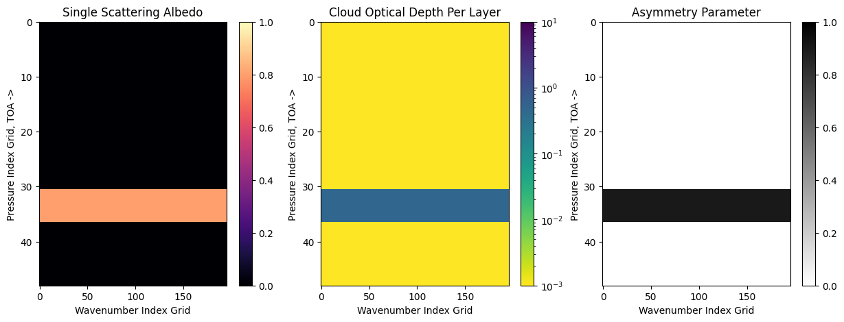
The PICASO box model is specified by a cloud layer with an asymmetry parameter (g0), a single scattering abledo (w0), an optical depth (opd) and a vertical pressure location (p,the pressure level in log10 bars) and finally the vertical cloud thickness (dp, the cloud thickness also in log10 bars). Such that:
cloud_base(bars)=\(10^p\)
cloud_top(bars)=\(10^{p−dp}\)
The single scattering albedo controls how scattering the cloud is. The asymmetry controls the degree of forward scattering. Checkout the PICASO radiative transfer tutorial to see a visual of the asymmetry phase function.
[34]:
# highly forward scattering cloud from 1.0 bar up to 0.1 bar
cld1.clouds( g0=[0.9], w0=[0.8], opd=[0.5], p = [0.0], dp=[1.0])
We can use the cloud input function to visualize what we just added to our code
[35]:
nwno = 196 #this is just the default number for the simple case above
nlayer = cld1.nlevel-1 #one less than the number of PT points in your input
fig = jpi.plot_cld_input(nwno, nlayer,df=cld1.inputs['clouds']['profile'])
Let’s similarly compute the spectrum and compare to our cloud free case
[36]:
out_cld = cld1.spectrum(opa, calculation='thermal',full_output=True)
#get the contribution as well now that we have all the chemistry!
contribution_cld = jdi.get_contribution(cld1, opa, at_tau=1)
#regrid
wno, fp_cld = jdi.mean_regrid(out_cld['wavenumber'], out_cld['thermal'], R=150)
wno, fpfs_cld = jdi.mean_regrid(out_cld['wavenumber'], out_cld['fpfs_thermal'], R=150)
[37]:
jpi.show(jpi.spectrum([wno,wno], [fpfs*1e6, fpfs_cld*1e6], legend=['Cloud free','Cloudy'],
                      y_axis_label='Relative Flux (ppm)',plot_width=600))
Looks relatively minor! Why is this? Let’s see the contribution plot with the cloud to find out
[38]:
jpi.show(jpi.molecule_contribution(contribution_cld, opa,
                                   min_pressure=4.5,
                                  R=100))
Do the minor modulations that you see in your cloudy thermal emission spectrum make sense with there the cloud tau=1 surface is?
Final Exercise: Return to where we defined the box model. Increase the cloud thickness until you can see it in the contribution plot.
What does your spectrum approach in the 100% cloud coverage?
What spectral features are first made undetectable because of clouds?
What spectral features are least inhibited by cloud coverage?
What JWST spectral models in 1-5 micron region are most susceptible to cloud coverage?