Using Full Output for Diagnostics
Sometimes it helps to have a bigger picture of what the full output is doing.
These steps will guide you through how to get out gain more intuition from your runs.
[1]:
#picaso
from picaso import justdoit as jdi
from picaso import justplotit as jpi
jpi.output_notebook()
WARNING: Failed to load Vega spectrum from /data/reference_data/picaso/ref4/stellar_grids/calspec/alpha_lyr_stis_011.fits; Functionality involving Vega will be severely limited: FileNotFoundError(2, 'No such file or directory') [stsynphot.spectrum]
We will use a cloudy Jupiter again to guide us through the exercise.
[2]:
opa = jdi.opannection(wave_range=[0.3,1])

case1 = jdi.inputs()

case1.phase_angle(0)

case1.gravity(gravity=25, gravity_unit=jdi.u.Unit('m/(s**2)'))

case1.star(opa, 6000,0.0122,4.437)

case1.atmosphere(filename = jdi.jupiter_pt(), sep=r'\s+')
case1.clouds(filename = jdi.jupiter_cld(), sep=r'\s+')
Return PICASO Full Output
[3]:
df = case1.spectrum(opa, full_output=True) #note the new last key
wno, alb, full_output = df['wavenumber'] , df['albedo'] , df['full_output']
Visualizing Full Output
Mixing Ratios
[4]:
jpi.show(jpi.mixing_ratio(full_output))
#can also input any key word argument acceptable for bokeh.figure:
#show(jpi.mixing_ratio(full_output, plot_width=500, y_axis_type='linear',y_range=[10,1e-3]))
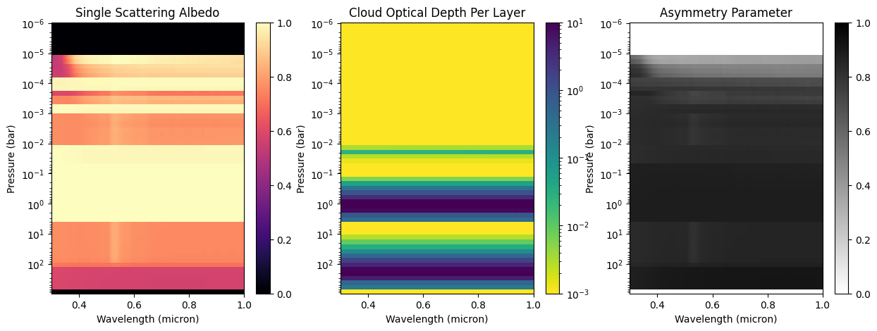
Cloud Profile
Depending on your wavelength grid, you might exceed Jupyter Notebook's data rage limit. You can fix this by initiating jupyter notebook with a higher data rate limit.
jupyter notebook --NotebookApp.iopub_data_rate_limit=10000000
[5]:
fig = jpi.cloud(full_output)
Pressure-Temperature Profile
[6]:
jpi.show(jpi.pt(full_output))
Heatmap of Molecular, Cloud, and Rayleigh Scattering Opacity
This will show you where your molecular, cloud and rayleigh scattering opacity become optically thick (\(\tau\)~1). Blue regions of the plot are optically thin, while red are optically thick.
[7]:
jpi.heatmap_taus(df)
[7]:
<Axes: title={'center': 'tauray'}, xlabel='Wavelength(um)', ylabel='Pressure(bars)'>
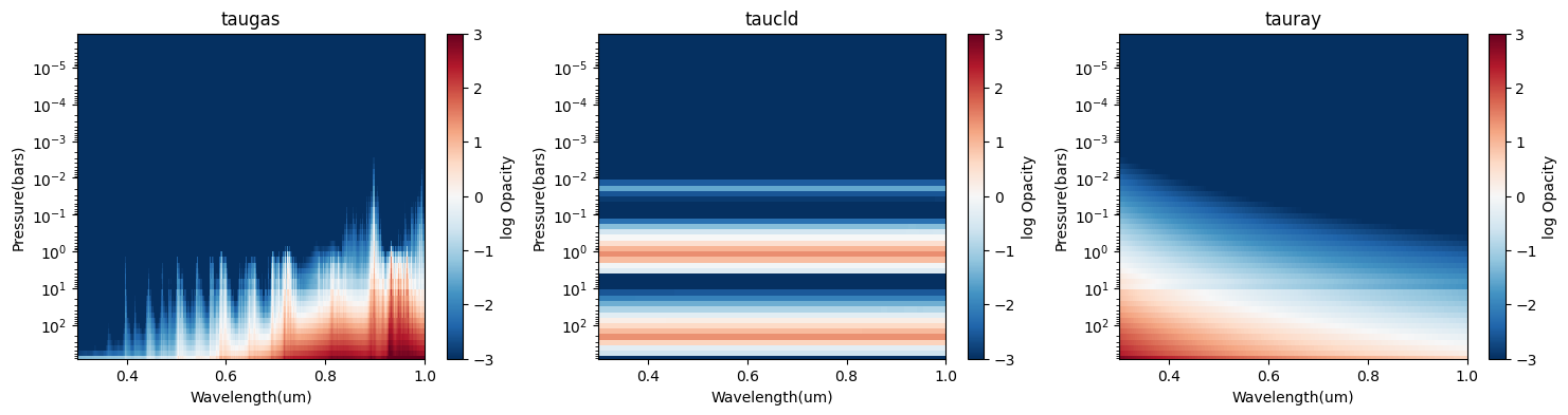
Sometimes, we just want to compare the \(\tau\sim 1\) surface for each component. This is effectively the plot below, the “photon attenuation”.
Photon Attenuation Depth
This is a useful plot to see the interplay between scattering and absorbing sources. It should explain why you are getting bright versus dark reflectivity.
To make this plot, we take data that is in previous plots (taugas, taucld, tauray), integrate it starting at the top of the atmosphere, then determine where a certain opacity hits the at_tau value.
[8]:
jpi.show(jpi.photon_attenuation(full_output, at_tau=0.1, plot_width=500))
Compare it to the spectrum and you can see right away what is driving the overall shape of your spectrum
[9]:
jpi.show(jpi.spectrum(wno,alb,plot_width=500))
Dissecting Full Output
[10]:
full_output.keys()
[10]:
dict_keys(['weights', 'layer', 'wavenumber', 'wavenumber_unit', 'taugas', 'tauray', 'taucld', 'level', 'latitude', 'longitude', 'star', 'albedo_3d', 'reflected_unit', 'warnings'])
[11]:
full_output['layer'].keys()
[11]:
dict_keys(['pressure_unit', 'mixingratio_unit', 'temperature_unit', 'pressure', 'mixingratios', 'temperature', 'column_density', 'mmw', 'cloud'])
[12]:
taugas = full_output['taugas'] #matrix that is nlevel x nwvno
taucld = full_output['taucld'] #matrix that is nlevel x nwvno
taugas = full_output['taugas'] #matrix that is nlevel x nwvno
[ ]: